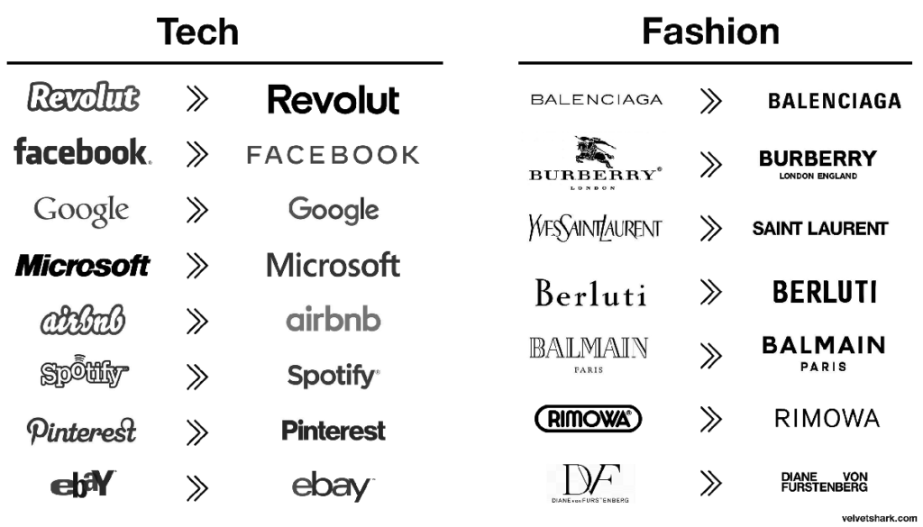
In recent years, a striking trend has emerged in the world of graphic design: more and more brands are adopting clean and simplified logos, often characterized by sans-serif typography. This “standardization” of logos marks a turning point in how companies choose to represent their visual identity. But why is this uniformity happening? Is it a strategic choice or a loss of originality?
The Rise of a Global Trend
Since the early 2010s, major companies like Google, Airbnb, and Mastercard have revamped their logos to embrace a more minimalist design. The use of sans-serif fonts, known for their lack of decorative elements and “feet” at the ends of letters, has become the norm. This approach aims to modernize the brand’s image, make it more readable on digital platforms, and adapt to screens of all sizes.

The Reasons Behind the Standardization
Several factors explain this uniformity:
- Simplicity and Legibility: In a world dominated by digital interactions, a simple and clean logo is easier to read and recognize, especially on small smartphone and tablet screens. Sans-serif fonts offer optimal readability, regardless of display size.
- Digital Adaptability: Simplified logos are better suited for various formats, whether it’s a mobile app, a website, or a business card. Flexibility is a major asset in an ever-evolving digital environment.
- Minimalist Trend: Minimalism has become a symbol of modernity and sophistication. By simplifying their logos, brands aim to project a sleek and contemporary image, in line with consumer expectations.
- Cultural Neutrality: In an era of globalization, companies are looking to establish themselves in diverse cultural markets. A standardized and minimalist logo avoids specific cultural connotations that may not translate well internationally.
Criticisms of Standardization
While this trend has its advantages, it is not without criticism. Some designers and branding experts lament the loss of originality and distinct identity between brands. A logo that was once unique and recognizable may now seem interchangeable with that of another company. This raises the question: Are brands sacrificing too much in the name of modernity?
Indeed, excessive simplification can lead to uniformity, where logos become less memorable and more generic. What defines a brand’s visual identity is not just simplicity, but also its unique character, which sets it apart from competitors.
Design Standardization in Urban Environments, Architecture, and Furniture
The trend of standardization extends beyond logos and into the realms of urban environments, architecture, and furniture design. In cities around the world, there is a growing tendency toward uniformity in building design and public spaces, often driven by the need for efficiency, cost-effectiveness, and adaptability. Modern architecture frequently favors clean lines, neutral colors, and modular structures, mirroring the minimalist aesthetics seen in brand logos. Similarly, in furniture design, the rise of flat-pack, easily assembled products from companies like IKEA reflects a broader trend toward simplicity and practicality. While this standardization can create cohesive and functional spaces, it also raises concerns about the loss of cultural identity and the unique character of urban landscapes. The challenge, as with branding, lies in finding a balance between standardization for practicality and maintaining the distinctiveness that gives spaces their unique sense of place.
Something to factor into your answer: The homogenization doesn't end with logos. It's happening to phone booths, doorbells, street poles, and bookshelves too.
— David Perell (@david_perell) July 9, 2022
(h/t @culturaltutor) pic.twitter.com/5cqBiA2GEb
Finding the Balance
The standardization of logos, with the widespread adoption of sans-serif typography, represents a natural evolution in an increasingly digital world. However, it is crucial for brands to strike a balance between the need to modernize their image and maintaining their originality. A logo must be both functional and distinctive, able to stand the test of time while remaining true to the brand’s identity.
The key might lie in a nuanced approach, where simplicity is used not as an end in itself, but as a means to clearly and coherently express the essence of the brand.


